The Burlington Performing Arts Centre
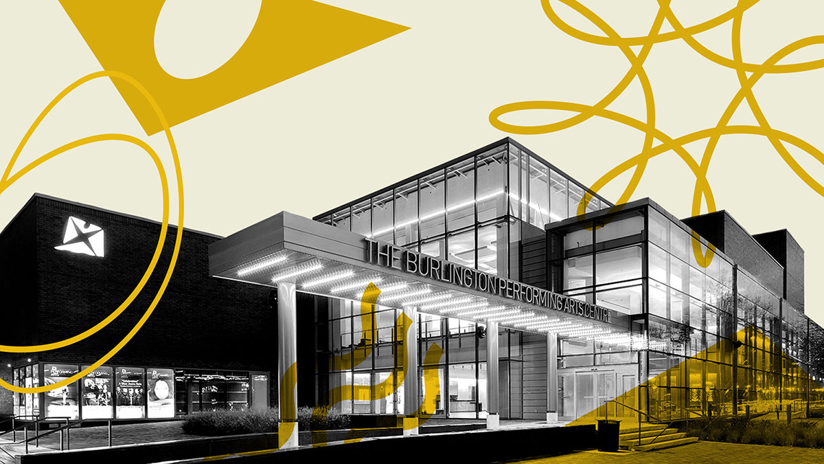
The Burlington Performing Arts Centre (BPAC) is a premier cultural destination and state-of-the-art theatre located in the heart of downtown Burlington.
Overview
As Creative Lead, my mandate was to bring all design work in-house and lead a comprehensive revitalization of BPAC’s visual identity, which had become fragmented over more than seven years of outsourced, inconsistent design practices.
To restore brand cohesion, I reintroduced BPAC’s original colour palette, (anchored in the logo) and reinstated the architectural typeface originally specified for the facility, reestablishing a unified visual language across all materials.
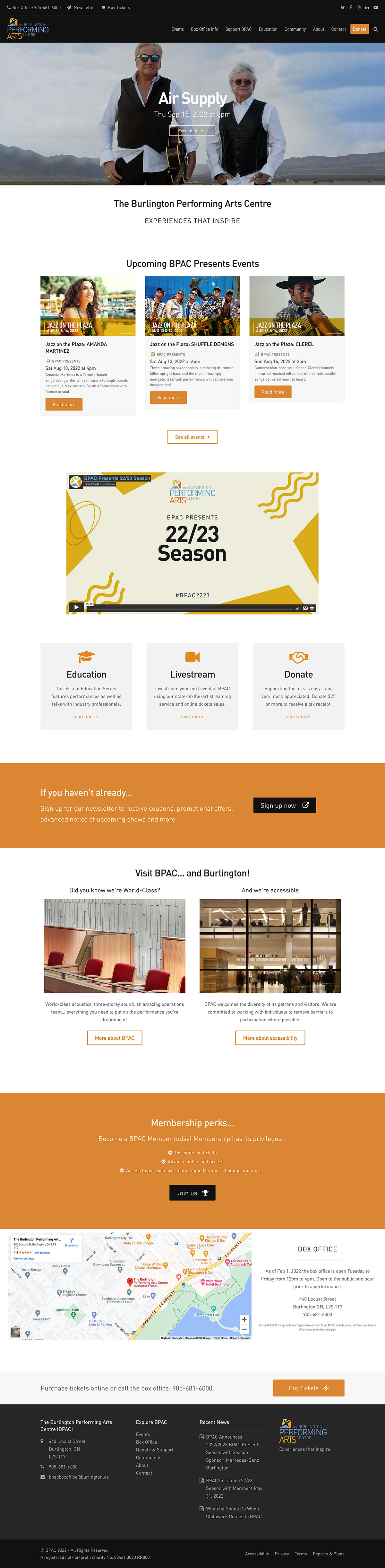
In addition, I led a complete redesign and rebuild of BPAC’s website, dramatically improving its visual appeal, usability, and functionality to better serve the hundreds of thousands of patrons who visit the site annually.
Challenge
Over the course of a decade, BPAC’s brand identity became fragmented and inconsistent. While the original architects provided initial branding guidelines, these were gradually abandoned due to staff and management turnover, lack of institutional memory, and inconsistent oversight. The absence of a centralized design strategy, combined with outsourcing, ad hoc design solutions, and the use of non-professional tools such as Microsoft Word and PowerPoint, contributed to a significant erosion of brand integrity.
Approach
1) Research
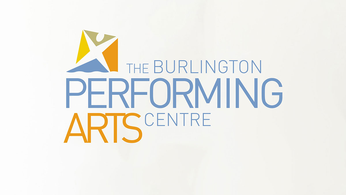
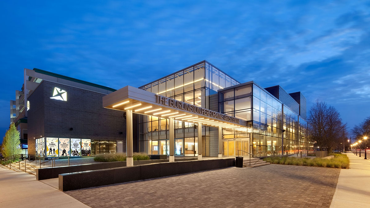
The architectural design of the facility thoughtfully integrates elements of the BPAC logo, also created by the architects, throughout the building’s interior. A distinctive wavy line, derived from the lower edge of the blue emblem in the logo, is a recurring motif, featured in etched glass panels and consistently applied across signage and wayfinding systems. Additionally, the typeface DIN, used in the original logo lockup, was selected as the standard for all signage, reinforcing a cohesive and intentional visual identity across the space.
2) Define
With a strong focus on the patron experience, I began the process of consolidating BPAC’s fragmented visual communications. A thorough audit of existing materials revealed the need to rebuild the brand from the ground up. I developed comprehensive branding and identity guidelines to establish a cohesive visual system; one that would shape how patrons and the broader public perceive and recognize BPAC going forward.
3) Ideate
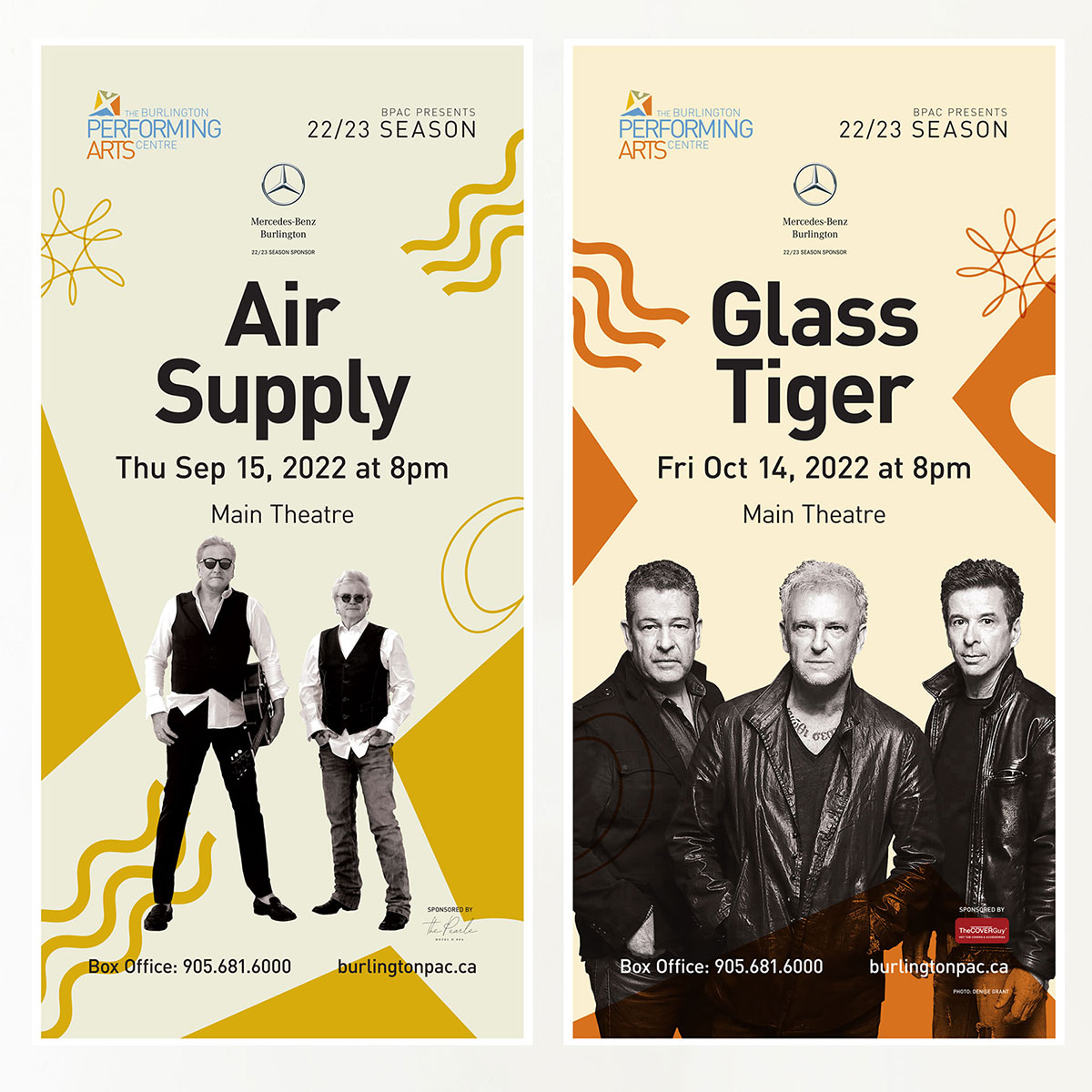
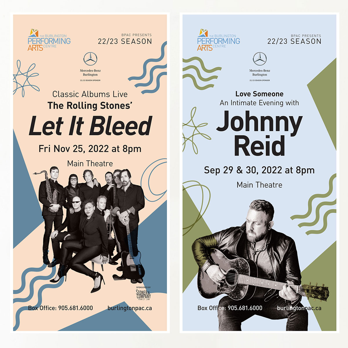
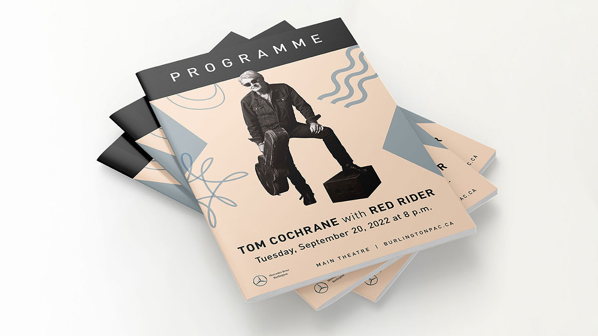
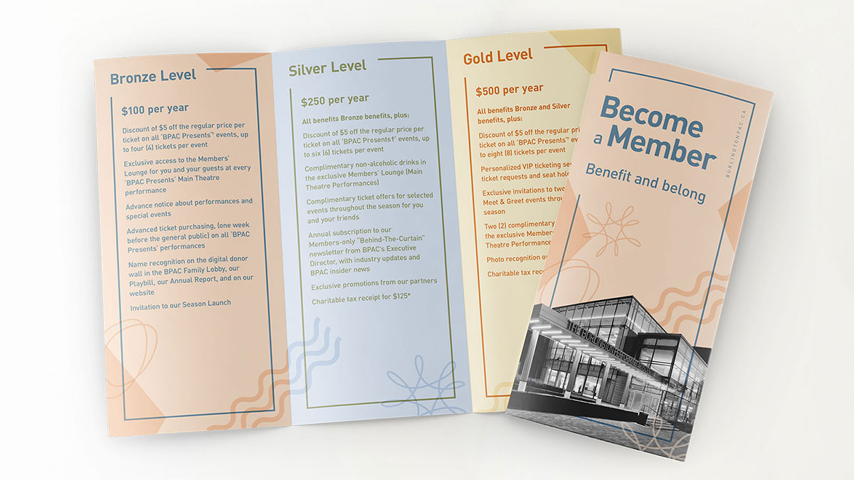
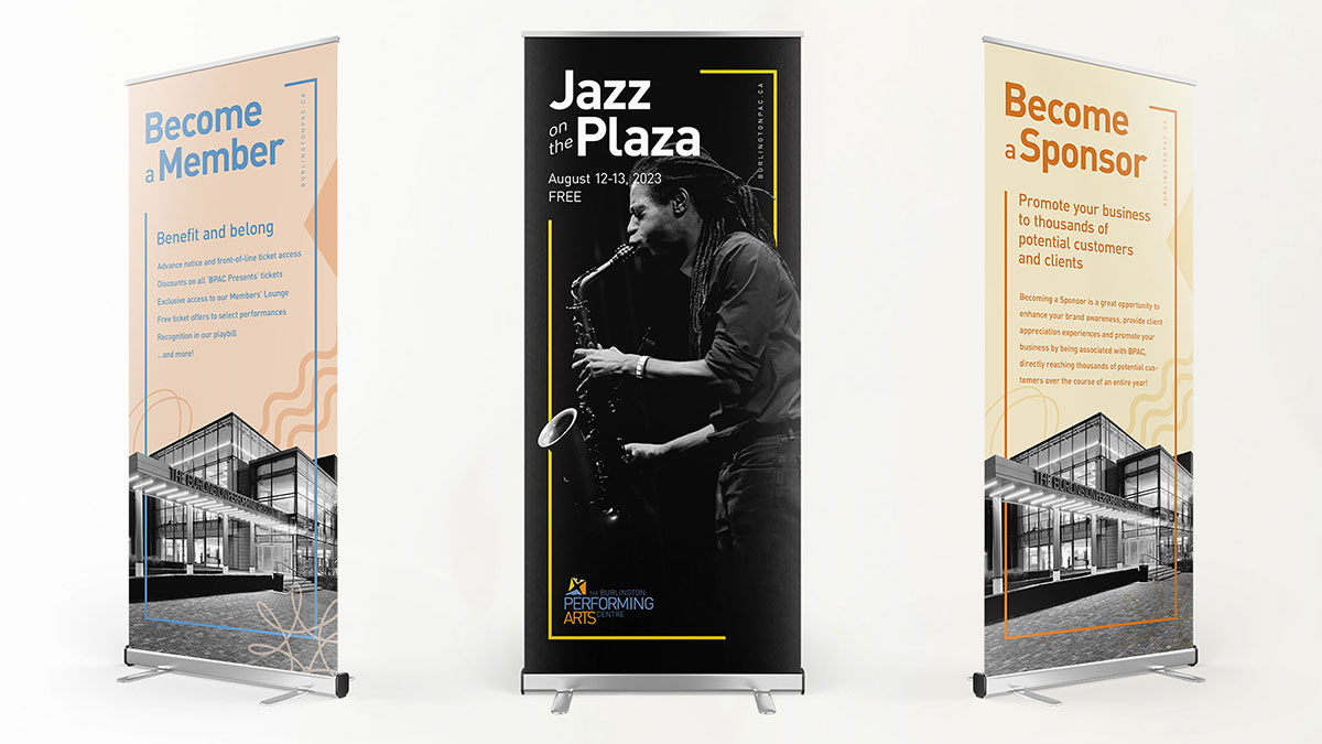
I reintroduced BPAC’s original typeface and colour palette across all design materials to restore visual consistency and honor the organization's foundational identity. Building on the emblem’s signature wavy line used architecturally throughout the facility, I began to explore and reinterpret the logo’s remaining shapes and negative space as standalone design elements. These forms, suggestive of energy, spotlights, and soundwaves, were integrated throughout digital and print compositions. Their dynamic arrangement brought renewed vibrancy to BPAC’s visual language while creating a meaningful connection to its history, architecture, and performing arts mission.
4) Implement
Using the original typeface, colour palette, and newly developed design elements, I implemented a design strategy that reestablished a cohesive, engaging, and recognizable brand identity for BPAC. For print materials, I applied tints of the original four colours as background layers, creating a foundation for the new graphic shapes. These shapes, derived from the logo and architectural elements, were styled using the original colours and thoughtfully paired to complement one another. Imagery was carefully masked, desaturated, and adjusted for contrast to ensure clarity and visual harmony across all compositions.



Site Redesign
I brought the design and management of BPAC’s website in-house, significantly reducing costs while greatly enhancing the user experience.
Guided by user feedback, I completely redesigned and rebuilt the website with a user-first approach. I streamlined and reorganized the navigation to improve usability, ensured consistent heading and page structures, and conducted a thorough SEO audit. These improvements led to increased web traffic and a more seamless and engaging experience for visitors.
Video and Digital Lobby Screens
To further reduce external costs, I took the initiative to bring video editing and production in-house by learning Adobe Premiere Pro. This allowed me to create high-quality video content for both marketing campaigns and educational programming.
At the same time, I began working in Figma to develop prototypes for digital screen templates used throughout the facility. These screens are a key part of the patron experience, and the new designs improved consistency, clarity, and visual impact. Examples are shown below.
Impact
The combined impact of these design choices was a complete revitalization of BPAC’s visual identity, resulting in a cohesive and professional brand that reflects the organization’s architectural roots and artistic mission. By bringing design, web, and video production in-house, I reduced external costs, improved creative control, and ensured consistency across all platforms. The reintroduction of original brand elements, paired with modern, user-focused design solutions, strengthened BPAC’s public image, enhanced the patron experience, and reestablished a strong visual connection between the physical space and its digital presence.