Evo Bicycle
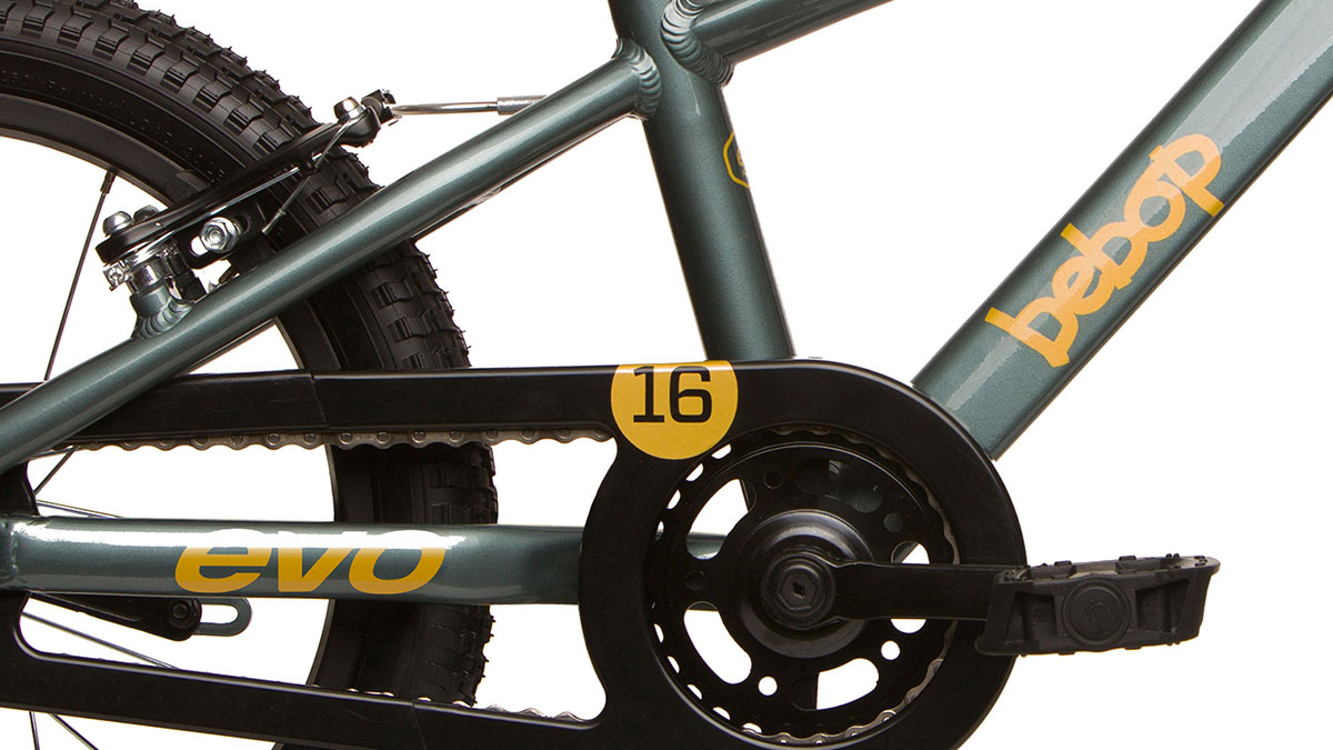
I helped direct the comprehensive rebranding of this bicycle company, overseeing the redesign of the logo, parts packaging, and bike graphics and colour schemes.
Overview
Bicycles have played a significant role in shaping my life and career. Beyond being a mode of transportation, they have served as a tool for mechanical and design problem-solving, a healthy hobby, and a creative outlet, particularly through BMX Flatland, (a discipline that instilled in me core values such as: dedication, attention to detail, perseverance, and the drive to exceed even my own expectations).
In 2023, I realized a personal milestone by joining HLC, North America’s largest and most reputable bicycle and parts distributor, as a Brand Designer. Over six months, I led a major brand revitalization for Evo® Bicycle, collaborating closely with a talented product line and brand team to deliver a comprehensive overhaul.
The Approach
The existing Evo brand and packaging felt outdated and ineffective. Key issues included a wordmark that appeared unfinished and was difficult to reproduce at small sizes, a dark and distracting colour scheme, glossy packaging that hindered readability, outdated typefaces that diminished perceived quality, and a confusing icon system for beginner and intermediate cyclists.
1) Research—beginning with packaging
Since parts and accessories are central to Evo’s business, a strong brand experience starts with the packaging. I conducted site visits to numerous local bike shops, ranging from independent retailers to larger chains, to observe Evo’s product range, placement, and visibility challenges firsthand.
2) Challenges
The existing dark navy packaging blended into typical dark shelving and black slat-wall displays, reducing visibility. Additionally, the script font compromised readability, and the icon system lacked clarity and usefulness.
3) Define user needs
Consumer behavior insights and sales feedback gathered over time were essential in addressing this challenge. A refreshed branding and packaging strategy was needed to highlight Evo’s high-quality products while ensuring an approachable and educational experience. The design focused on delivering only the essential information, adopting a straightforward, no-frills approach for consumers selecting parts.
4) Ideate
Through multiple design iterations, critiques, and collaborative online meetings, the information architecture for the new packaging took shape. Brainstorming involved team members at all levels, and strategic decisions generated actionable insights that added significant value to the redesign.
5) Implement
Once the direction was finalized, I refined the new packaging concept, and after securing approval from upper management, the project proceeded to full implementation.

Rebranding & Packaging Overhaul
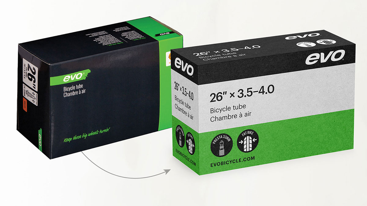
I redesigned the Evo logo to create a more approachable and friendly brand identity. This involved filling in negative space, rounding sharp edges, and balancing proportions, all while maintaining the original logo’s overall shape.
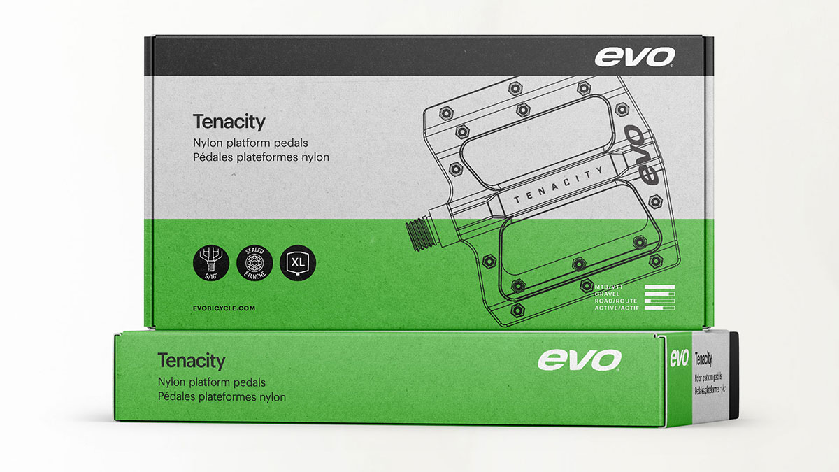
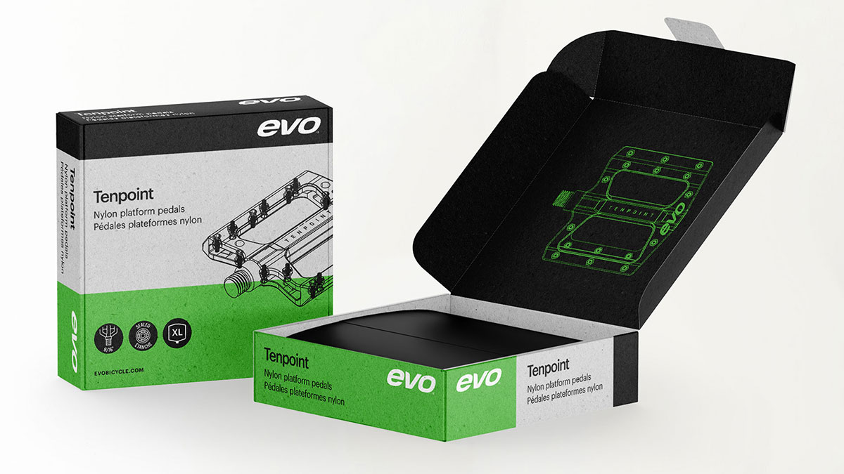
The packaging was refreshed by introducing a light grey, recycled, and unfinished paperboard substrate. Its matte texture and natural feel not only enhance the tactile experience but also convey eco-friendliness and soften the previously vibrant green colour. I replaced the script fonts and outdated icons with a single, clear typeface to improve legibility and consistency.
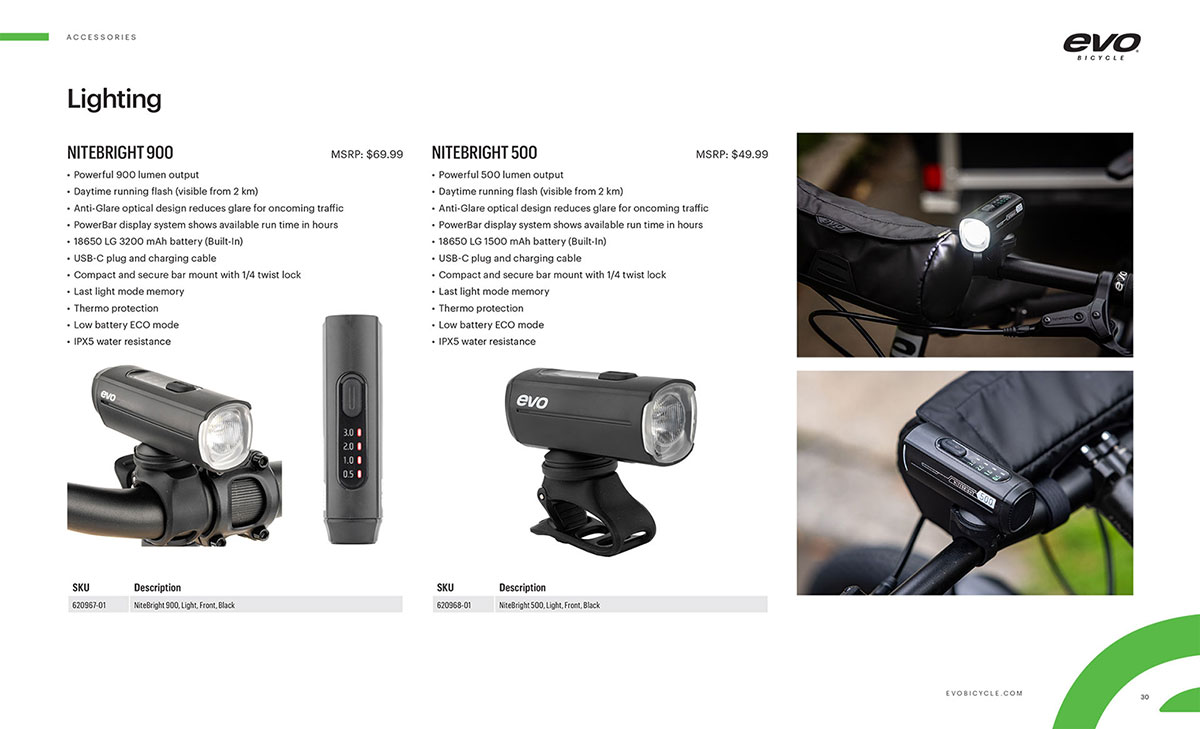
New circular icons were developed to highlight key features and benefits, alongside a usage graph and suitability chart for products with multiple functions.
These design updates elevated Evo’s product presentation to a more premium level while preserving the brand’s approachable and authentic character.

Bicycle Colorways and Graphics
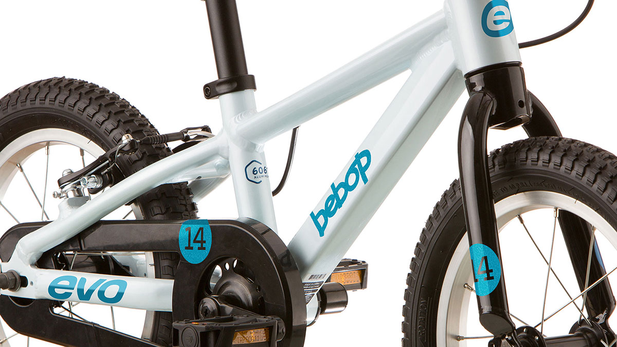
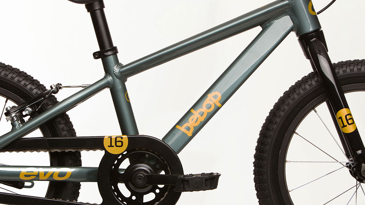
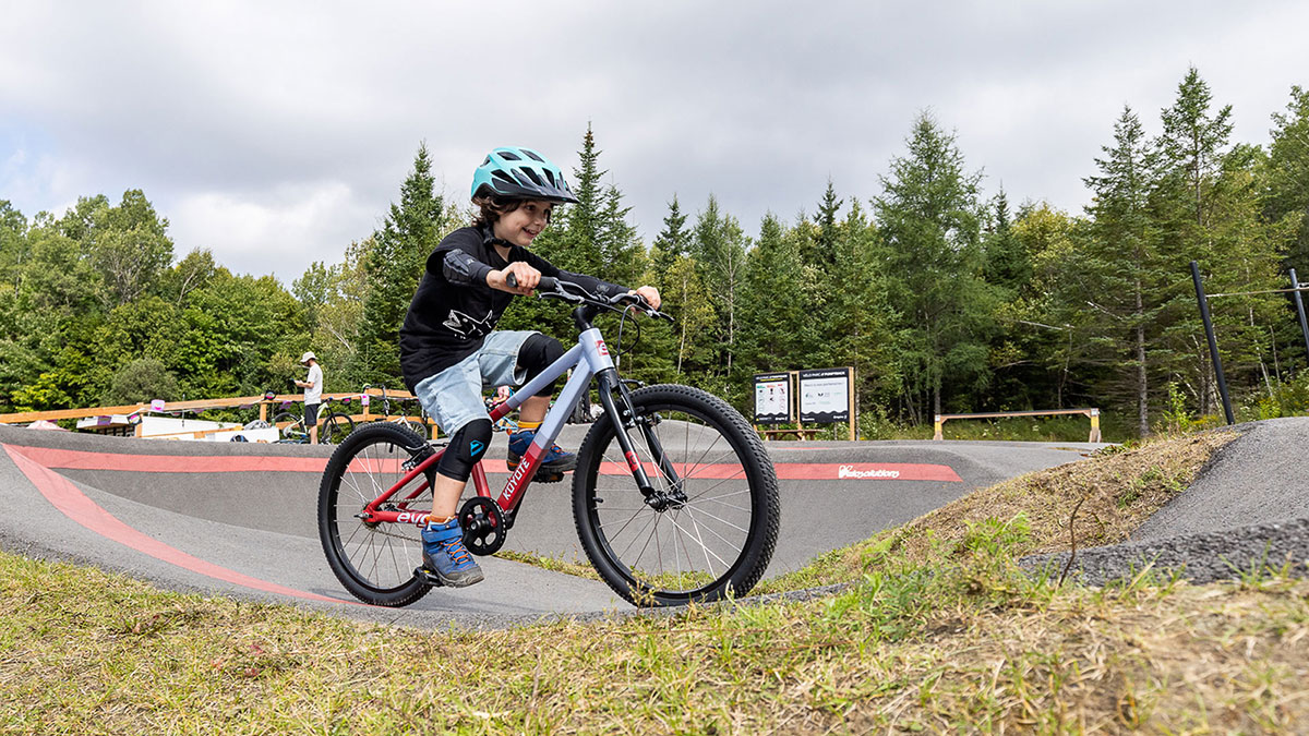
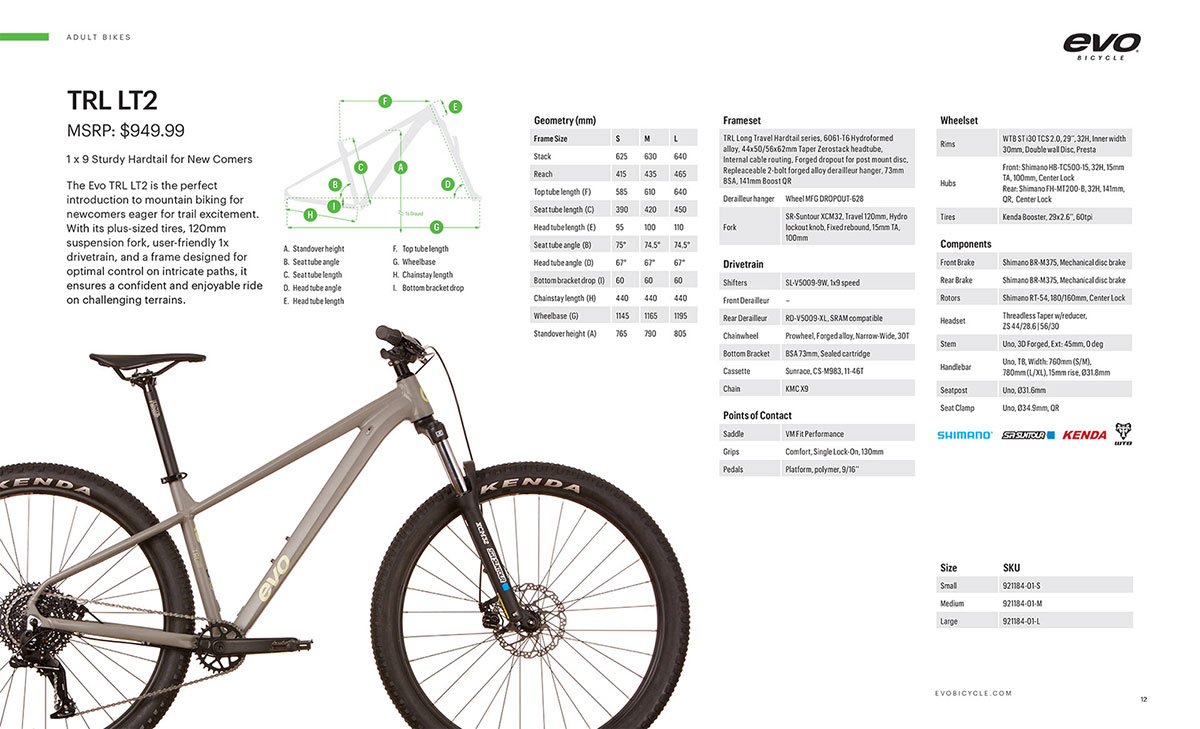
I led the design of the complete 2024 Evo bike colour and graphics line. Decal size and placement were critical due to manufacturing constraints, including tube profiles, weld locations, and the positioning of parts and accessories.
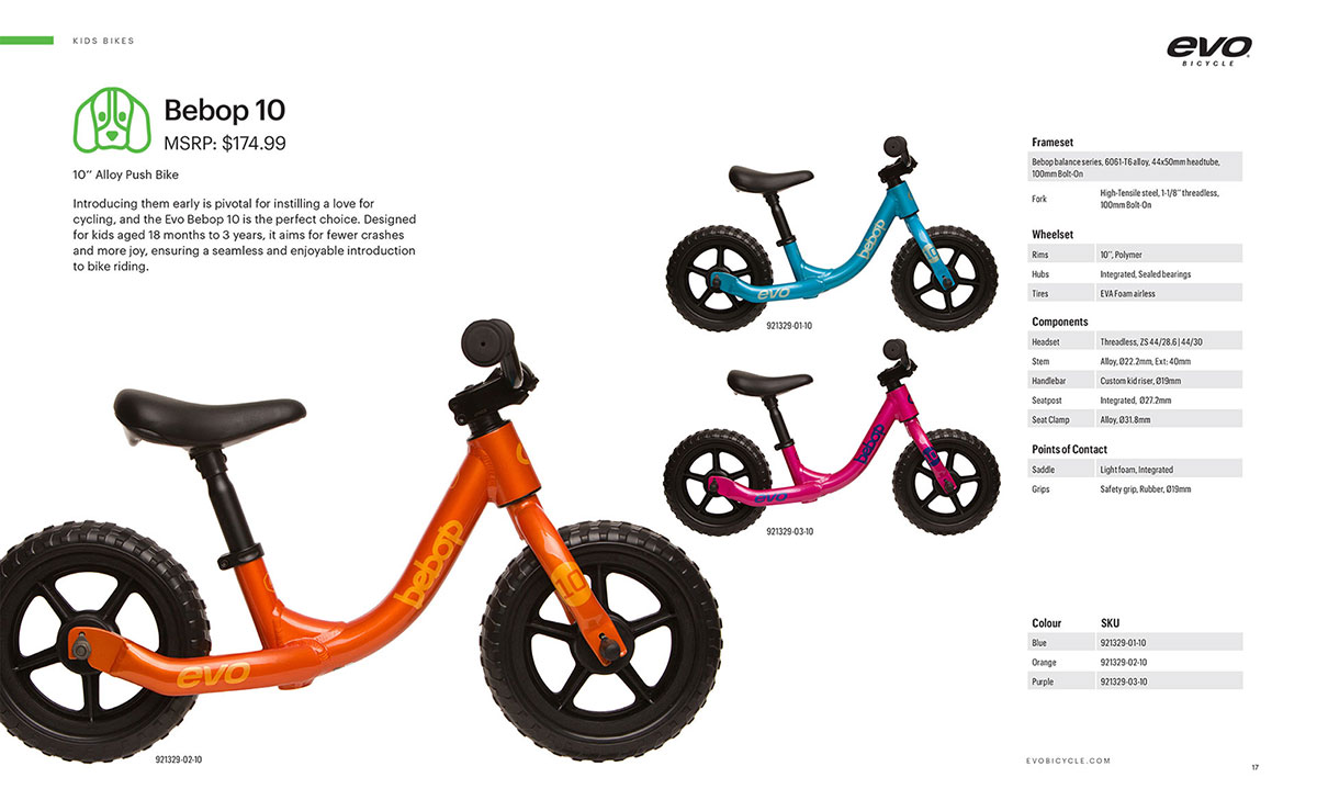
I developed numerous colorways for each bike size, ranging from children’s models to high-end adult and e-bikes. These options were refined to a final selection of three to four colorways per frame size.
Additionally, I created custom wordmarks and graphics to categorize riding styles into distinct families, enhancing brand coherence across the product range.
Despite the complexity of the 20- to 24-inch kids’ bike colorways, all designs stayed within budget. The full bike line secured strong vendor bookings and generated enthusiastic support from the sales team.
Print Design
With the new brand elements established, I began updating both new and existing packaging across the product line.
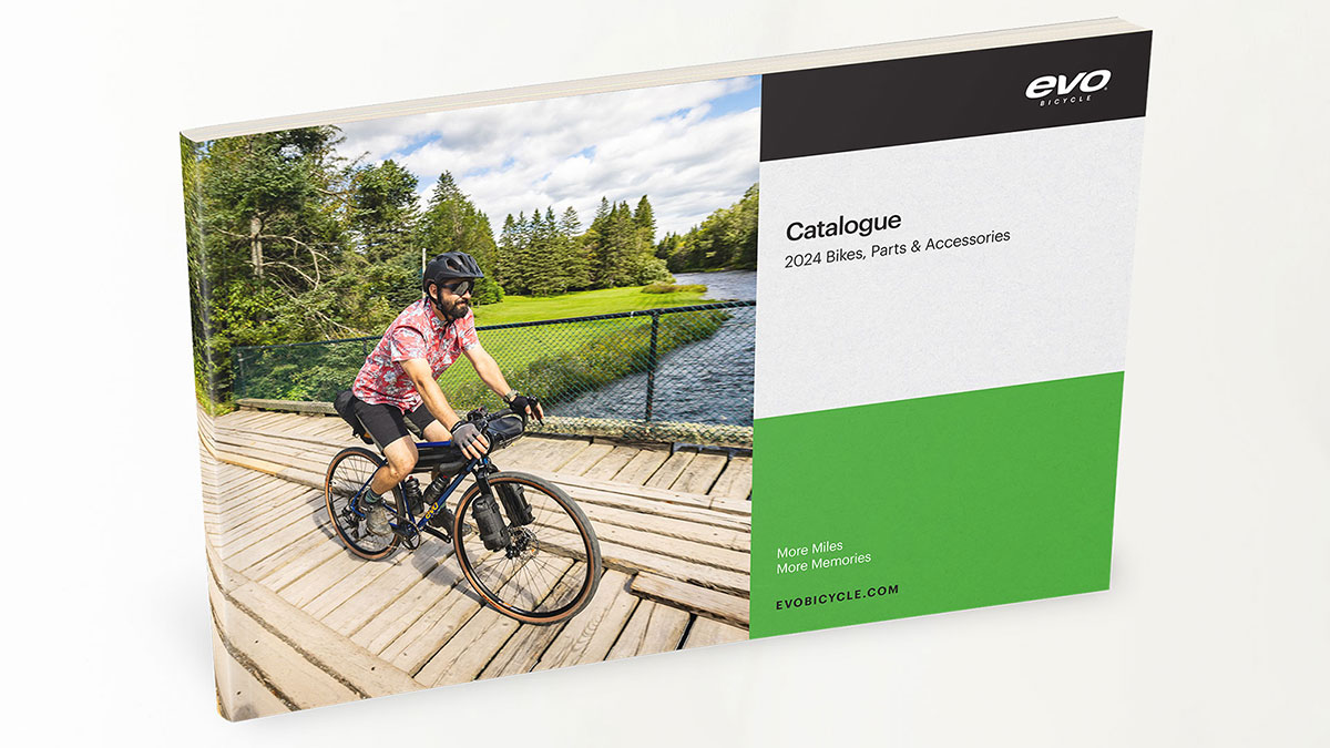
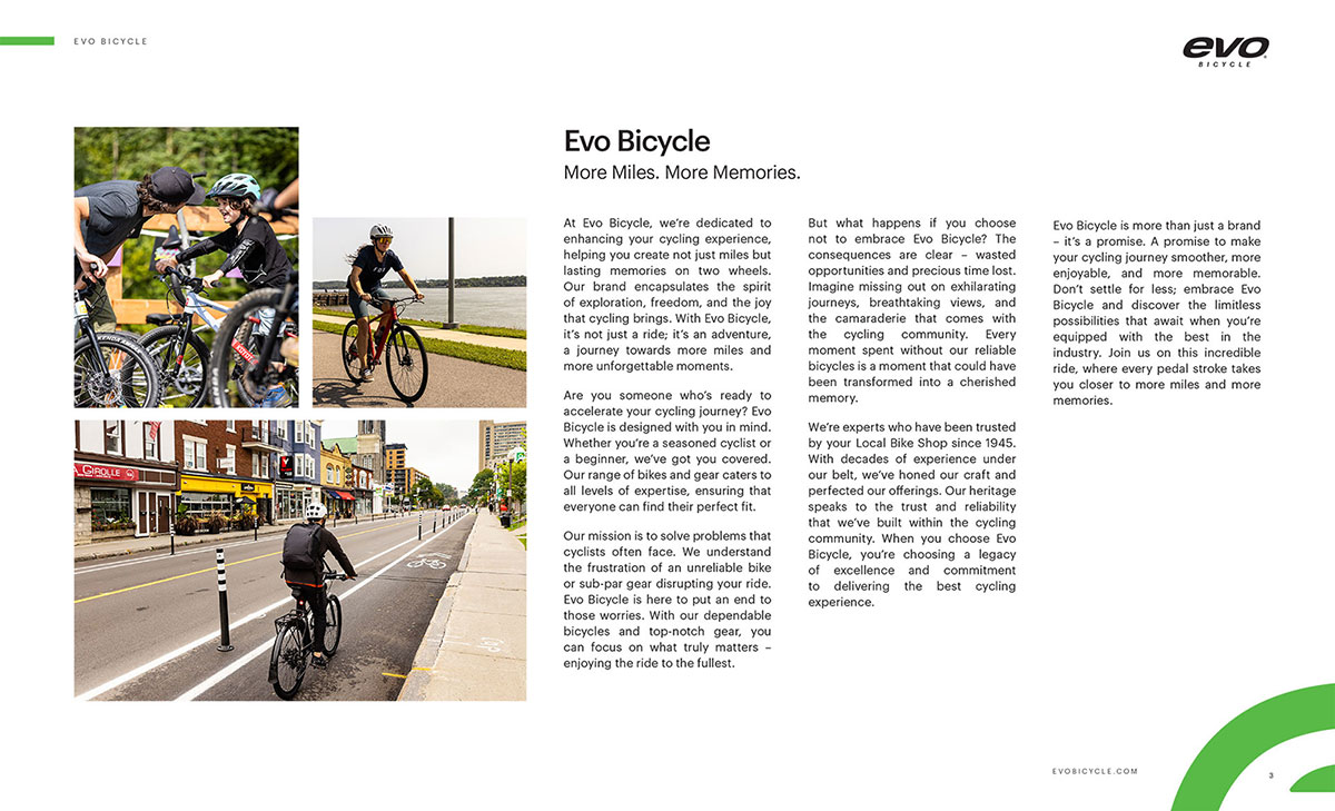
I also designed a range of printed sales collateral, including multilingual catalogs, sell sheets, brochures, flyers, instruction manuals, and point-of-purchase (POP) displays.

Impact
The rebrand and packaging redesign elevated Evo’s market presence by creating a more approachable, modern identity that resonated with both new and experienced cyclists. Improved logo clarity, simplified typography, and intuitive iconography enhanced readability and shelf visibility, particularly in retail settings with dark fixtures. The use of eco-friendly materials and a consistent visual system strengthened product appeal and brand trust.
Custom graphics and categorized wordmarks helped differentiate product families, guiding consumers toward the right choices with minimal friction. These changes not only improved the user experience but also boosted confidence across sales and vendor teams, leading to stronger bookings and a more unified presentation of Evo in the market, all while staying within budget.