Minerva Creek Brewing Company
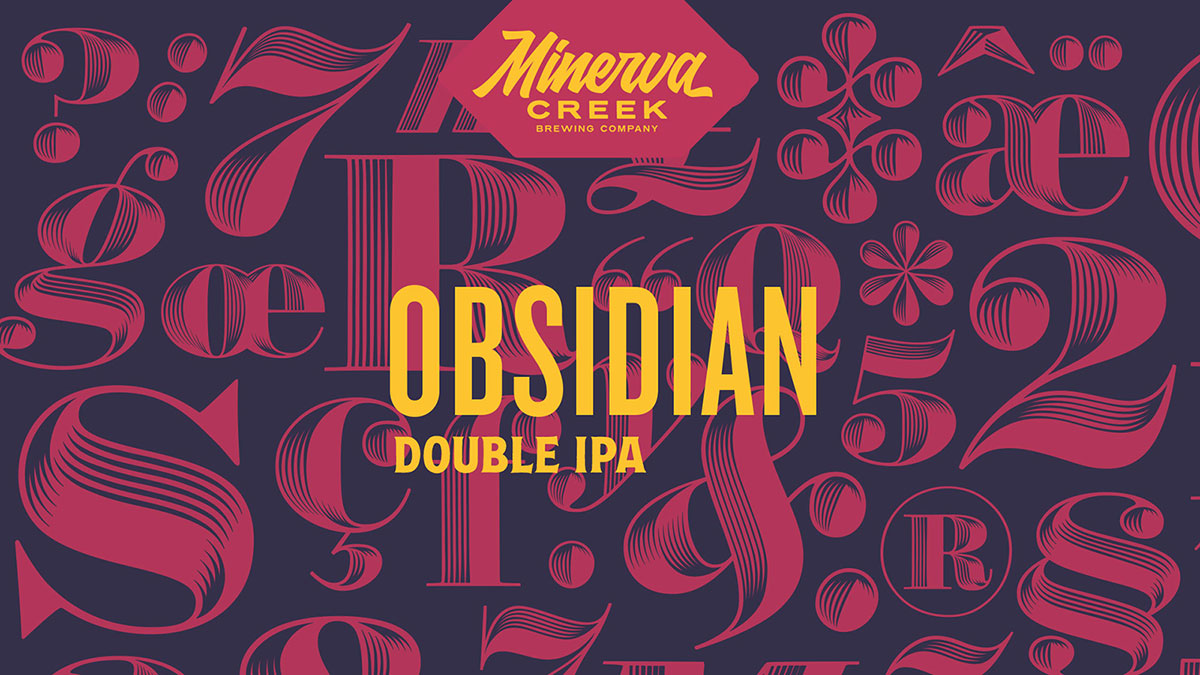
Packaging design and typography are two interests of mine, often occupying my thoughts simultaneously.
Opportunities to explore both with full creative freedom are rare, so I initiated a personal project that allowed me to combine these interests.
It is rare that I get to work on projects with carte blanche, so I decided to tackle my own project and combine those two interests.
I challenged myself to develop a brand from the ground up, providing a platform to experiment with a diverse range of distinctive typefaces. To thoroughly realize the brand, I took on the creation of:
- Company name and logo
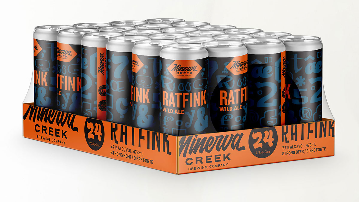
- Packaging design for product lines
- A fully responsive website
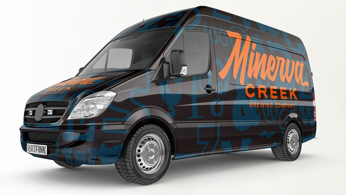
- Vehicle wrap design
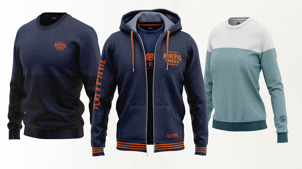
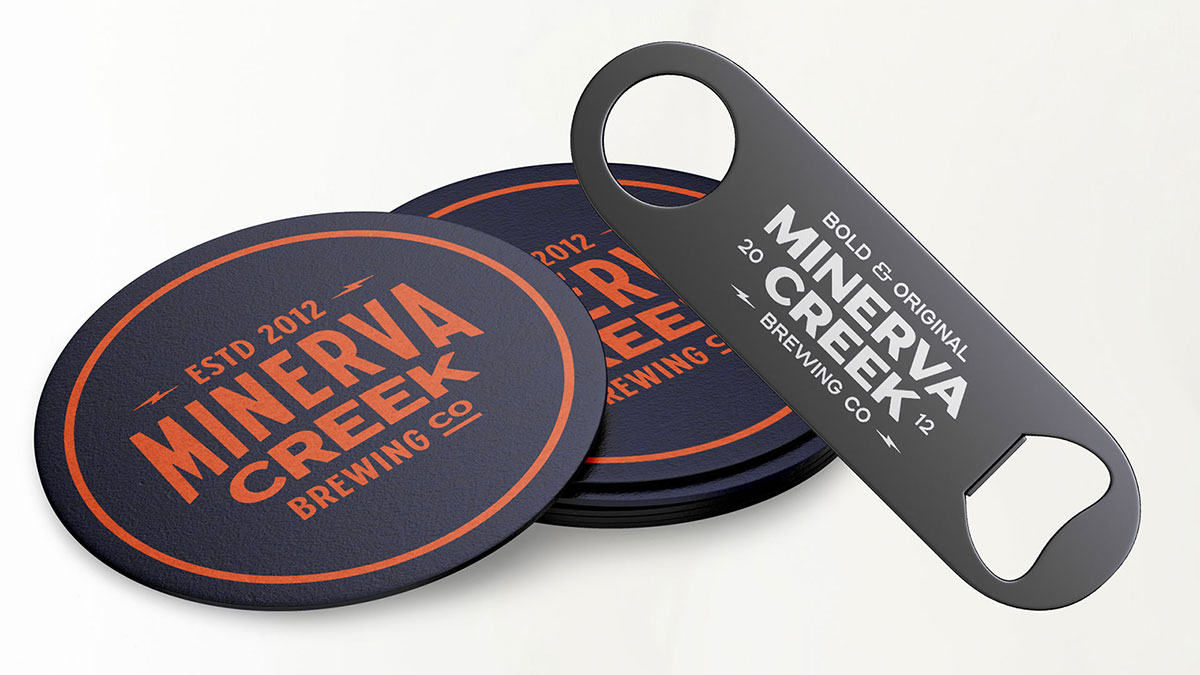
- Various branded collateral
Solution
I chose to explore a range of typefaces through the lens of a fictional brewing company, which offered limitless opportunities for product variation and creative expression.
Packaging Design
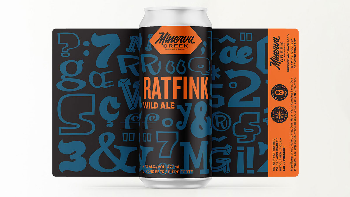
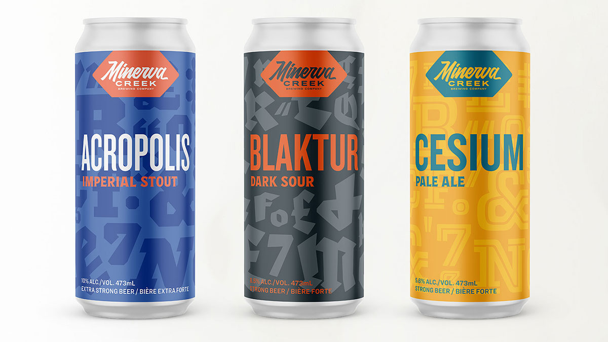
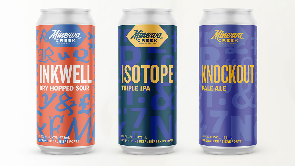
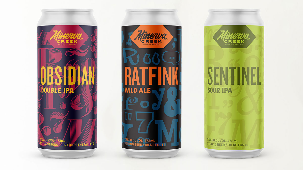
Once the company name and logo were finalized, I began developing individual products, each named after a typeface I was exploring. The background of each can label served as a canvas to highlight unique glyphs and typographic features, allowing for deeper creative exploration within each design.
Web Design
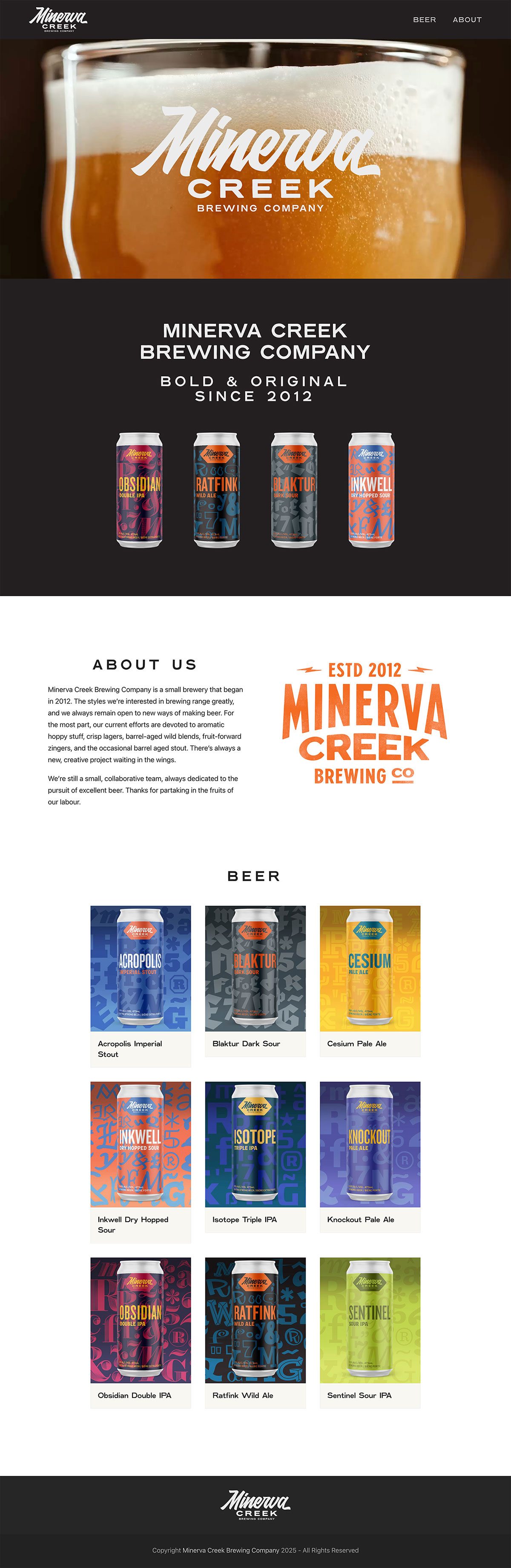
As part of the brand experience, I also designed a fully responsive website featuring a custom video hero background to enhance visual engagement.
This project allowed me to push creative boundaries and approach design holistically; from brand identity and packaging to digital and environmental applications. It deepened my understanding of how typography can shape perception, convey narrative, and influence user experience across multiple touchpoints. Beyond expanding my technical skill set, it reinforced the value of self-initiated work in driving innovation, showcasing my ability to build cohesive, concept-driven design systems from the ground up.